
Back after a month of hospitals and therapy, but actually back teaching - now for something different
a japanese composition term in design &pictorialcomposition - "Notan" has been making the rounds lately and caught my attention and explains why some art "works" better than others.. Why teach it, because simply it makes sense. How to Make Stronger Compositions Using Lights and Darks
Many cultures throughout history have created artwork using both styles, design &pictorial, although the actual term Notan appeared a lot later. there are actually two approaches to Notan: the first approach is mainly pictorial while the second is more akin to graphic design
-------------------------------------------------
Paper Tube Scupture
In grade school the students experimented with tube sculpture without really modifying the basic construction.

In high school the shapes can no longer be recognized as a tube-based form.
Tubes are taken apart and reshaped into forms either amorphic or symbolic...

lots and lots of tape and paper maché

But all final projects must still have a hole!
Semester Project Time
In break with tradition, I'm encouraging students to extend what we've worked on - on their own initiative, own choice of medium, and own choice of topic - all within the constraints of two-weeks time frame.
String art, or pin and thread art, is characterized by an arrangement of colored thread strung between points to form abstract geometric patterns

or representational designs,

sometimes with other artist material comprising the remainder of the work.

Thread, wire, or string is wound around a grid of nails hammered into a painted or velvet-covered wooden board. Though straight lines are formed by the string, the slightly different angles and metric positions at which strings intersect may give the appearance of Bézier curves (and often construct actual quadratic Bézier curves). Other forms of string art include Spirelli, which is used for cardmaking and scrapbooking, and curve stitching, in which string is stitched through holes.
String art has its origins in the 'curve stitch' activities invented by Mary Everest Boole at the end of the 19th Century to make mathematical ideas more accessible to children. It was popularised as a decorative craft in the late 1960s through kits and books.
----------------------------------------------------------------
Calligraphy is a type of visual art. It is often called the art of fancy lettering. A contemporary definition of calligraphic practice is "the art of giving form to signs in an expressive, harmonious and skillful manner". The story of writing is one of aesthetic evolution framed within the technical skills, transmission speed(s) and material limitations of a person, time and place. A style of writing is described as a script, hand or alphabet.
Modern calligraphy ranges from functional hand-lettered inscriptions and designs to fine-art pieces where the abstract expression of the handwritten mark may or may not compromise the legibility of the letters. Classical calligraphy differs from typography and non-classical hand-lettering, though a calligrapher may create all of these; characters are historically disciplined yet fluid and spontaneous, at the moment of writing.


The principal tools for a calligrapher are the pen, which may be flat-balled or round-nibbed, and the brush. For some decorative purposes, multi-nibbed pens—steel brushes—can be used. However, works have also been made with felt-tip and ballpoint pens, although these works do not employ angled lines. Ink for writing is usually water-based and much less viscous than the oil based inks used in printing. High quality paper, which has good consistency of porosity, will enable cleaner lines, although parchment or vellum is often used, as a knife can be used to erase work on them and a light box is not needed to allow lines to pass through it. In addition, light boxes and templates are used to achieve straight lines without pencil markings detracting from the work. Ruled paper, either for a light box or direct use, is most often ruled every quarter or half inch, although inch spaces are occasionally used, such as with litterea unciales (hence the name), and college ruled paper acts as a guideline often as well.
Pens may be obtained from various stationery sources - from the traditional "nib" pens dipped in ink, to calligraphy pens that have cartridges built-in, avoiding the need to have to continually dip them into inkwells.
------------------------------------------------------------
The first assignment of the second quarter is a request from the office of the governor of Montana. Each year for the past seven there have been 56 trees set up in the capitol - one for each county, and students across the state have sent in decorations for their trees. The theme this year is "What 'homegrown' means to you."
Students are decorating old 'cds' with their concepts for their contributions.
The governor's office will take pictures of the decorated trees and place them on their website.
Visit www.governor.mt.gov to View the Trees
--------------------------------------

Assignment #9
Patterned Ink Drawings
Goals: Students will create an ink drawing in which a variety of lines, patterns, and designs are incorporated into a visually engaging composition.
Materials:
Buff paper, preferably cardstock, size and shape optional
Ultra-Fine black permanent markers (Sharpies)
Buff paper, preferably cardstock, size and shape optional
Ultra-Fine black permanent markers (Sharpies)
Procedure:
1. Show examples of patterned ink drawings.
2. Explain that students will be working on an ink drawing. They are to start in one corner of the paper and work outward, always making sure that each element of the drawing is touching a previously drawn portion. They are to make each component different from the other elements in their drawing. They can strictly use patterns, but sometimes the negative space around the elements will suggest an object, and those can be included.
3. Emphasize that there should be little "planning" for this; the best designs seem to spring from spontaneous imagination. If they make a "mistake," they should simply alter the pattern to incorporate it.
4. Drawings should be continued until the paper is full of lines, textures, and designs.


Assignment #8
Part 1 - Self-portrait Collage
Students draw a self-portrait from observation (using mirror) then fill the outside with images that describe their life.

- since we don't have enough mirrors, students will alternate drawing figure poses using mannequins posed around an object of their choice.


Assignment #7
"Your Life As A Movie"The "Your Life as a Movie" (*or "Video Game", “Music Album” or "Novel") poster assignment is a project I've used and adapted. It allows me to get all art students working on a project, while getting a feel for their skills and knowledge that we’ve covered so far in my Art I and Art II classes.
We begin this project by looking at a wide variety of posters and discussing what makes them effective.Students discuss the use of color, title placement, and what can be learned about each movie, based on the images. They also discuss the "mood" of each poster, as well as the overall composition and design.
Their assignment is to pretend that a movie* has been filmed about their life and they are to design a poster that will advertise it. They must include an original title for their movie, their name, and images that show their interests or that tell something about them. Their posters must include tempera paint and at least two other mediums.
Students usually have about a week and a half to complete their posters. This project allows them to demonstrate their general creative ability; their sense of design and composition; their ability to do lettering, use color and demonstrate their color mixing, painting and drawing skills. It also shows their ability to make good use of class time and meet deadlines.
When the posters are finished, students are randomly assigned a poster to DESCRIBE (no judgement allowed) in a written paragraph or two and they must also do a written critique of their own poster. Having them slow down, look, think and write at the beginning of the year--with their very first project--helps them gain appreciation for their own skills, as well as for those of their peers. And given the nature of the project, they also gain insights into the lives and interests of their new classmates!
Assignment #6Scheming with Colors
The monochromatic color scheme uses variations in lightness and saturation of a single color. This scheme looks clean and elegant. Monochromatic colors go well together, producing a soothing effect. The monochromatic scheme is very easy on the eyes, especially with blue or green hues. You can use it to establish an overall mood. The primary color can be integrated with neutral colors such as black, white, or gray. However, it can be difficult, when using this scheme, to highlight the most important elements.
Pros:The monochromatic scheme is easy to manage, and always looks balanced and visually appealing.Cons:This scheme lacks color contrast. It is not as vibrant as the complementary scheme.Tips: 1. Use tints, shades, and tones of the key color to enhance the scheme.2. Try the analogous scheme; it offers more nuances while retaining the simplicity and elegance of the monochromatic scheme.
The analogous color scheme uses colors that are adjacent to each other on the color wheel. One color is used as a dominant color while others are used to enrich the scheme. The analogous scheme is similar to the monochromatic one, but offers more nuances.
Pros:The analogous color scheme is as easy to create as the monochromatic, but looks richer.Cons:The analogous color scheme lacks color contrast. It is not as vibrant as the complementary scheme.Tips:1. Avoid using too many hues in the analogous scheme, because this may ruin the harmony.2. Avoid combining warm and cool colors in this scheme.
The complementary color scheme is made of two colors that are opposite each other on the color wheel. This scheme looks best when you put a warm color against a cool color, for example, red versus green-blue. The complementary scheme is intrinsically high-contrast.
When using the complementary scheme, it is important to choose a dominant color and use its complementary color for accents. Using one color for the background and its complementary color to highlight important elements, you will get color dominance combined with sharp color contrast.
Pros:The complementary color scheme offers stronger contrast than any other color scheme, and draws maximum attention.Cons:This scheme is harder to balance than monochromatic and analogous schemes, especially when desaturated warm colors are used.Tips:1. For best results, place cool colors against warm ones, for example, blue versus orange.2. If you use a warm color (red or yellow) as an accent, you can desaturate the opposite cool colors to put more emphasis on the warm colors.3. Avoid using desaturated warm colors (e.g. browns or dull yellows).4. Try the split complementary scheme; it is similar to the complementary scheme but offers more variety.
Assignment #5Perspective
The two kinds of perspective that artists use are linear and atmospheric (or aerial). Linear perspective uses lines and vanishing points to determine how much an object’s apparent size changes with distance. Atmospheric perspective deals with how the appearance of an object is affected by the space or atmosphere between it and the viewer. Leonardo da Vinci noticed this latter phenomenon and dubbed it “the perspective of disappearance.”
Used together, linear and atmospheric perspective can create the illusion of space and dimension in your art, whether a vast landscape or an intimate still life. Here are five effects used in rendering perspective, which you easily can incorporate into your work.
1. Diminishing size2. Diminishing detail3. Diminishing contrast4. Lightening of overall values5. Neutralization of color/possible shift to blue
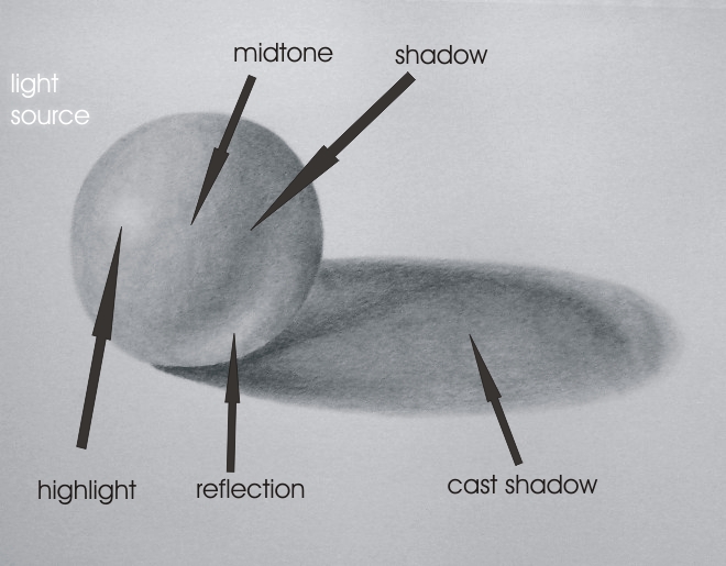
Assignment #4Light and shadows visually define objects. Before you can draw the light and shadows you see, you need to train your eyes to see like an artist.

Values are the different shades of gray between white and black. Artists use values to translate the light and shadows they see into shading, thus creating the illusion of a third dimension.Hatching and crosshatching are simple and fun techniques for drawing shading. Shading with the edge of the pencil and scribbling (squirkeling) are also useful techniques.A full range of values is the basic ingredient for shading. When you can draw lots of different values, you can begin to add shading, and therefore depth, to your drawings.With shading, the magical illusion of three-dimensional reality appears on your drawing paper.

Assignment #3Unlikely JuxtapositionsStudents change normal expectations. Hard things are soft. Large is small. Smooth is rough. Down is up. Inside is outside. Brittle is flexible. Light is dark. Natural becomes geometric. Manufactured goods grow on the farm. Numbers become animals. Dream world ideas are developed. Each student does 10 sketches, selects three to improve. One is improved at least three times. Final project is an improvement made from the improved version.
Assignment #2"Draw What You Feel in the Bag" GameProcedure:Students will be given a paper bag in which there is a small object. They are not to look in the bag, and they are not to try to "identify" the object, because to do so would cause them to draw their "left brain symbol" for the object.
Instead, they are to use their hand and fingers to explore the size, shape, and texture of the unseen object. Based solely on their sense of touch, they are to draw what is in the bag. After they have finished, they may look at the object to see how accurately they were able to render it.Some objects in the paper bags included a guitar string winder, an oddly-shaped Lego piece, the base off of a box fan, a flat refrigerator magnet in the shape of a house, a plastic drinking straw with a heart shape in the middle, a plastic icing/frosting texturer (I have no idea what this thing is really called!), a pen top, and an assortment of other miscellaneous small, unusual objects with distinct shapes.This game worked even better than I imagined it would. After students had finished, we discussed how easy or how hard it was to draw just from the sense of touch.
Assignment #1
"Describer-Drawer" GameProcedure:
1. Seat two students together at a table. One student will be the "drawer," and the other student will be the "describer."2. The "describer" holds an index card on which is drawn a simple design comprised of geometric shapes. The "drawer" has a blank sheet of paper and a pencil, and is not allowed to see the card.3. The "describer" chooses a starting point and tells the "drawer" to (for example) draw a horizontal line in the center of the page that is approximately 3 inches long.4. The "describer" may look at the drawing that is being produced by the "drawer" and may offer verbal corrections (regarding length of the line, size of the circle, etc.) but may not offer visual cues (by motioning).5. The "describer" continues to offer verbal cues to the "drawer" until the drawing is completed. Compare the completed drawing with the image on the index card.6. Switch roles and choose a new card.
Art I is a general introductory course designed for ALL students. NO prior art experience is necessary! Curious about art?, this is a great place to start! In Art I, the basic Elements of Art (line, shape, space, form, value, texture and color) and Principles Of Design (contrast, emphasis, balance, unity, pattern, rhythm and movement) are introduced through "hands-on" projects in drawing, painting, printmaking, ceramics, and sculpture. All basic materials are provided for you, except any special materials you may want, and a pencil.
There are four parts to a disciplined art basic programs:
The "Your Life as a Movie" (*or "Video Game", “Music Album” or "Novel") poster assignment is a project I've used and adapted. It allows me to get all art students working on a project, while getting a feel for their skills and knowledge that we’ve covered so far in my Art I and Art II classes.
We begin this project by looking at a wide variety of posters and discussing what makes them effective.
We begin this project by looking at a wide variety of posters and discussing what makes them effective.
Students discuss the use of color, title placement, and what can be learned about each movie, based on the images. They also discuss the "mood" of each poster, as well as the overall composition and design.
Their assignment is to pretend that a movie* has been filmed about their life and they are to design a poster that will advertise it. They must include an original title for their movie, their name, and images that show their interests or that tell something about them. Their posters must include tempera paint and at least two other mediums.
Students usually have about a week and a half to complete their posters. This project allows them to demonstrate their general creative ability; their sense of design and composition; their ability to do lettering, use color and demonstrate their color mixing, painting and drawing skills. It also shows their ability to make good use of class time and meet deadlines.
When the posters are finished, students are randomly assigned a poster to DESCRIBE (no judgement allowed) in a written paragraph or two and they must also do a written critique of their own poster. Having them slow down, look, think and write at the beginning of the year--with their very first project--helps them gain appreciation for their own skills, as well as for those of their peers. And given the nature of the project, they also gain insights into the lives and interests of their new classmates!
Assignment #6
Scheming with Colors
The monochromatic color scheme uses variations in lightness and saturation of a single color. This scheme looks clean and elegant. Monochromatic colors go well together, producing a soothing effect. The monochromatic scheme is very easy on the eyes, especially with blue or green hues. You can use it to establish an overall mood. The primary color can be integrated with neutral colors such as black, white, or gray. However, it can be difficult, when using this scheme, to highlight the most important elements.
Pros:
The monochromatic scheme is easy to manage, and always looks balanced and visually appealing.
Cons:
This scheme lacks color contrast. It is not as vibrant as the complementary scheme.
Tips:
1. Use tints, shades, and tones of the key color to enhance the scheme.
2. Try the analogous scheme; it offers more nuances while retaining the simplicity and elegance of the monochromatic scheme.
The analogous color scheme uses colors that are adjacent to each other on the color wheel. One color is used as a dominant color while others are used to enrich the scheme. The analogous scheme is similar to the monochromatic one, but offers more nuances.
Pros:
The analogous color scheme is as easy to create as the monochromatic, but looks richer.
Cons:
The analogous color scheme lacks color contrast. It is not as vibrant as the complementary scheme.
Tips:
1. Avoid using too many hues in the analogous scheme, because this may ruin the harmony.
2. Avoid combining warm and cool colors in this scheme.
The complementary color scheme is made of two colors that are opposite each other on the color wheel. This scheme looks best when you put a warm color against a cool color, for example, red versus green-blue. The complementary scheme is intrinsically high-contrast.
When using the complementary scheme, it is important to choose a dominant color and use its complementary color for accents. Using one color for the background and its complementary color to highlight important elements, you will get color dominance combined with sharp color contrast.
Pros:
The complementary color scheme offers stronger contrast than any other color scheme, and draws maximum attention.
Cons:
This scheme is harder to balance than monochromatic and analogous schemes, especially when desaturated warm colors are used.
Tips:
1. For best results, place cool colors against warm ones, for example, blue versus orange.
2. If you use a warm color (red or yellow) as an accent, you can desaturate the opposite cool colors to put more emphasis on the warm colors.
3. Avoid using desaturated warm colors (e.g. browns or dull yellows).
4. Try the split complementary scheme; it is similar to the complementary scheme but offers more variety.
Assignment #5
Perspective
The two kinds of perspective that artists use are linear and atmospheric (or aerial). Linear perspective uses lines and vanishing points to determine how much an object’s apparent size changes with distance. Atmospheric perspective deals with how the appearance of an object is affected by the space or atmosphere between it and the viewer. Leonardo da Vinci noticed this latter phenomenon and dubbed it “the perspective of disappearance.”
Used together, linear and atmospheric perspective can create the illusion of space and dimension in your art, whether a vast landscape or an intimate still life. Here are five effects used in rendering perspective, which you easily can incorporate into your work.
1. Diminishing size
2. Diminishing detail
3. Diminishing contrast
4. Lightening of overall values
5. Neutralization of color/possible shift to blue

Students change normal expectations. Hard things are soft. Large is small. Smooth is rough. Down is up. Inside is outside. Brittle is flexible. Light is dark. Natural becomes geometric. Manufactured goods grow on the farm. Numbers become animals. Dream world ideas are developed. Each student does 10 sketches, selects three to improve. One is improved at least three times. Final project is an improvement made from the improved version.
Assignment #2
"Draw What You Feel in the Bag" Game
Procedure:
Students will be given a paper bag in which there is a small object. They are not to look in the bag, and they are not to try to "identify" the object, because to do so would cause them to draw their "left brain symbol" for the object.
Instead, they are to use their hand and fingers to explore the size, shape, and texture of the unseen object. Based solely on their sense of touch, they are to draw what is in the bag. After they have finished, they may look at the object to see how accurately they were able to render it.
Some objects in the paper bags included a guitar string winder, an oddly-shaped Lego piece, the base off of a box fan, a flat refrigerator magnet in the shape of a house, a plastic drinking straw with a heart shape in the middle, a plastic icing/frosting texturer (I have no idea what this thing is really called!), a pen top, and an assortment of other miscellaneous small, unusual objects with distinct shapes.
This game worked even better than I imagined it would. After students had finished, we discussed how easy or how hard it was to draw just from the sense of touch.
Assignment #1
"Describer-Drawer" Game
Procedure:
1. Seat two students together at a table. One student will be the "drawer," and the other student will be the "describer."
2. The "describer" holds an index card on which is drawn a simple design comprised of geometric shapes. The "drawer" has a blank sheet of paper and a pencil, and is not allowed to see the card.
3. The "describer" chooses a starting point and tells the "drawer" to (for example) draw a horizontal line in the center of the page that is approximately 3 inches long.
4. The "describer" may look at the drawing that is being produced by the "drawer" and may offer verbal corrections (regarding length of the line, size of the circle, etc.) but may not offer visual cues (by motioning).
5. The "describer" continues to offer verbal cues to the "drawer" until the drawing is completed. Compare the completed drawing with the image on the index card.
6. Switch roles and choose a new card.
- The project or product (lets make something)
- Art Appreciation (quality of art)
- Art History (who did what when)
- Critiquing Art (my work is good because... or Monet’s work is good because....)
We will be doing Unit studies in:- Drawing: - perspective, figure drawing ...
- Painting: - brush, knife, airbrush ...
- Printing: - lithography, serigraphy
- Sculpture: - relief, free-standing, kinetic
- Ceramics: hand built and thrown
- Art history: then and now (year-long)
- Creative projects never done before
(We will try working with several different medias so you have a chance to see the difference.)- Drawing: - Pencil, Charcoal, Pastels, ...
- Sculpture: - metal, wood, found objects, tape ...
- Painting: - Acrylics, oils, watercolors
- Computer graphics
- Pottery: - glazing vs painting vs raw
The project ideas you do will be your choice, but the media will be all the same for the first part of the Unit. You will be able to select the media you want to work with the last part of 4th nine weeks.
- The project or product (lets make something)
- Art Appreciation (quality of art)
- Art History (who did what when)
- Critiquing Art (my work is good because... or Monet’s work is good because....)
We will be doing Unit studies in:
- Drawing: - perspective, figure drawing ...
- Painting: - brush, knife, airbrush ...
- Printing: - lithography, serigraphy
- Sculpture: - relief, free-standing, kinetic
- Ceramics: hand built and thrown
- Art history: then and now (year-long)
- Creative projects never done before
(We will try working with several different medias so you have a chance to see the difference.)
- Drawing: - Pencil, Charcoal, Pastels, ...
- Sculpture: - metal, wood, found objects, tape ...
- Painting: - Acrylics, oils, watercolors
- Computer graphics
- Pottery: - glazing vs painting vs raw
The project ideas you do will be your choice, but the media will be all the same for the first part of the Unit. You will be able to select the media you want to work with the last part of 4th nine weeks.